Behind our Rebrand

We're excited to announce a new brand experience!
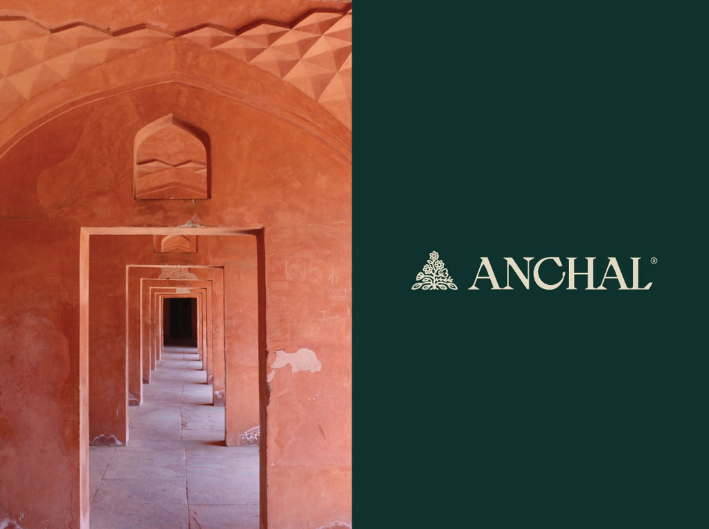
The Hindi word "anchal" refers to the edge of the sari that is often used to provide comfort and protection to loved ones, or more simply it means shelter. With this special meaning in mind, we set out to update our branding to not only encapsulate the essence of the word, but also the future of the organization.
As some of you may remember, the first 'A' logo evoked a feeling of enveloping a loved one in a hug, a feeling of comfort, with soft rounded edges found in a cursive 'A'. It then evolved into a logo of functionality, a simple written font accompanied by a pronunciation guide.
As Anchal and its products have matured over the past 10 years, we felt that it was time the visual brand aesthetic matured as well. With the help of our talented friends at Zimmer Design, Anchal now has a customized logo, marks, color palette, and patterns.
We believe the new visual brand represents the comfort found in the anchal and the richness of storytelling, as well as, the beautiful and vibrant products the artisans create. We hope you love the new look as much as we do.
See below for all of the details.


Comments on this post (1)
Beautiful!!!!! Seriously beautiful.
— Hannah Schiller